Project Overview
In working with ZapLabs, Realogy’s innovation and technology hub, we were asked to determine why they were getting so many calls to customer support and why their support page was not being received well by users.
During a round table video conference with developers and zap users, we learned that the majority of them were left frustrated after visiting the support page. When trying to get the usability answers they needed, the agents simply e-mailed or worse, phoned technical support with their questions and dissatisfaction.
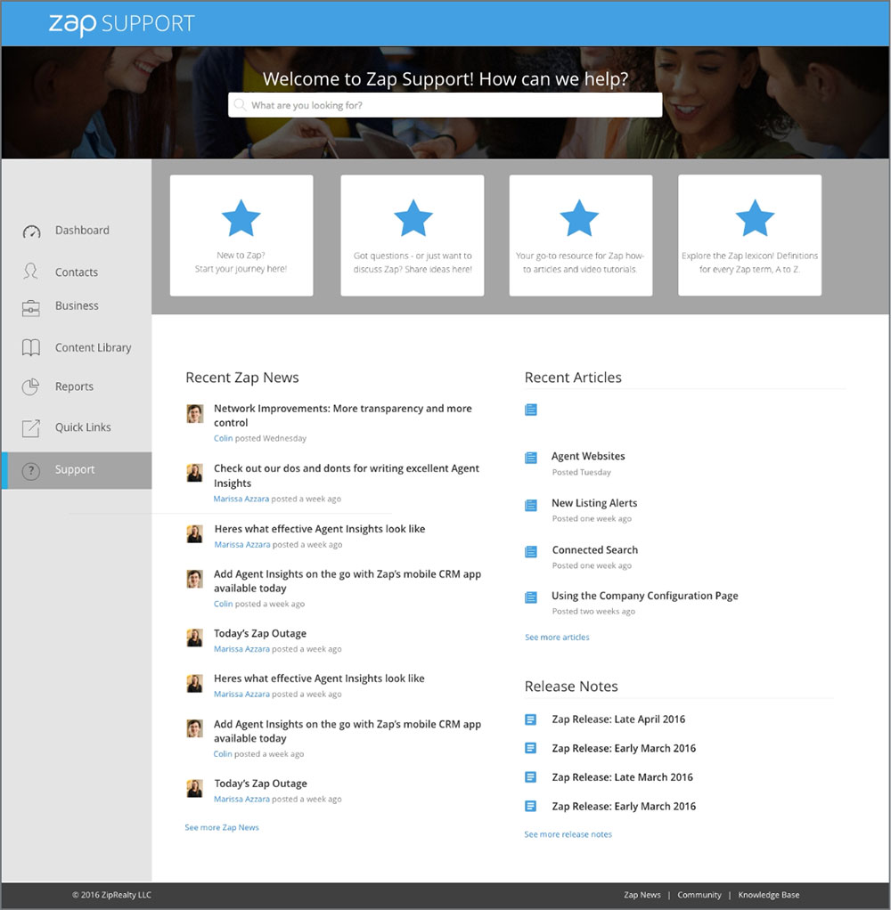
Testing revealed the iconography was unclear
A redesign of visual elements was in order to ensure a better customer experience.

We discovered that 90% of users that visited the support page would leave without having clicked on any other links on that page.
We identified the problem by looking closely at the analytics, as well as interviewing a small group of power users. After gathering insights from collected data, we determined that the main icon buttons were being mistaken for decorative graphics as opposed to section headings.
Our Solution
We needed to create graphic elements that informed the user visually, that this was the launch point to further content as well as create an overall harmonious feel.
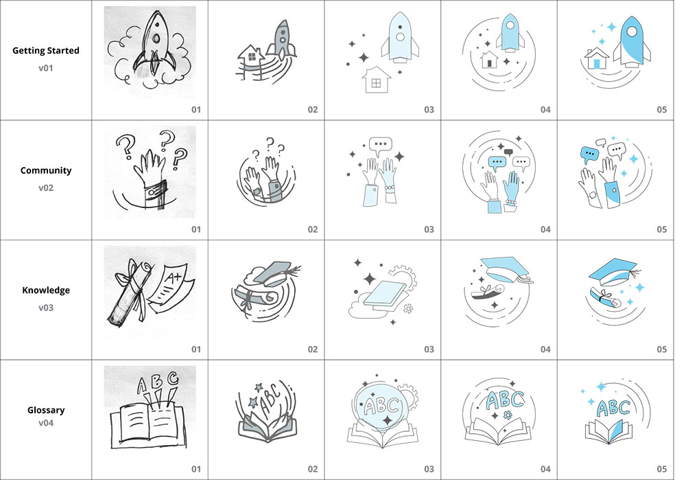
I began with sketching ideas for each individual button.
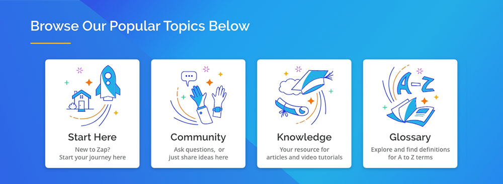
Beginning with the Getting Started, I used a Rocket Ship to create a sense of anticipation and impart in the user the beginning of a journey. Followed by Community, Knowledge, and Glossary, I created illustrations depicting the main section headings for the support page.
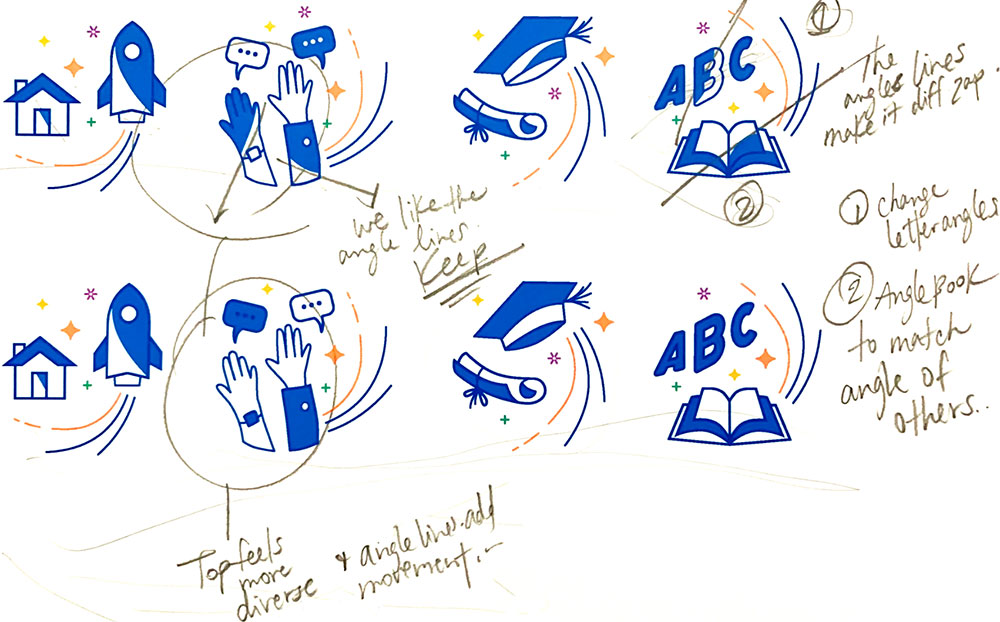
My Process
My process included visual research for competitive analysis and also inspiration. Once I had a workable rough prototype we pushed those out for testing. The insightful feedback we received from users helped me in refining the visuals and moving towards a direction that could be used to inform as part of zaps visual design language.
Prototypes and Testing
We quickly tested prototypes with rough icon designs to see if users would identify the new icons as helpful topics and also to see if it was clear to the user that they could click on each for more detailed information on that topic.
Testing with users was performed before we even finalized the icon designs to make sure that we were moving in the right direction and to validate our assumptions. After multiple rounds of testing with my colleagues, I was able to simplify the icons for readability and create a more fluid and overall cohesive looking layout with the rest of the content on the page.
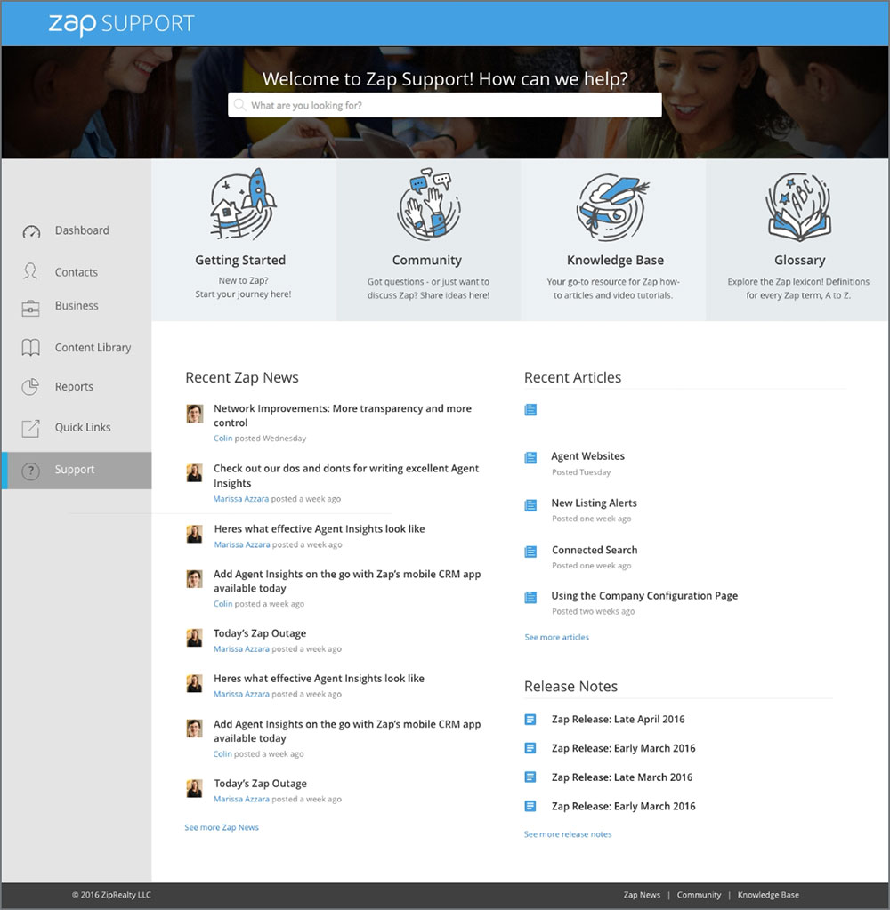
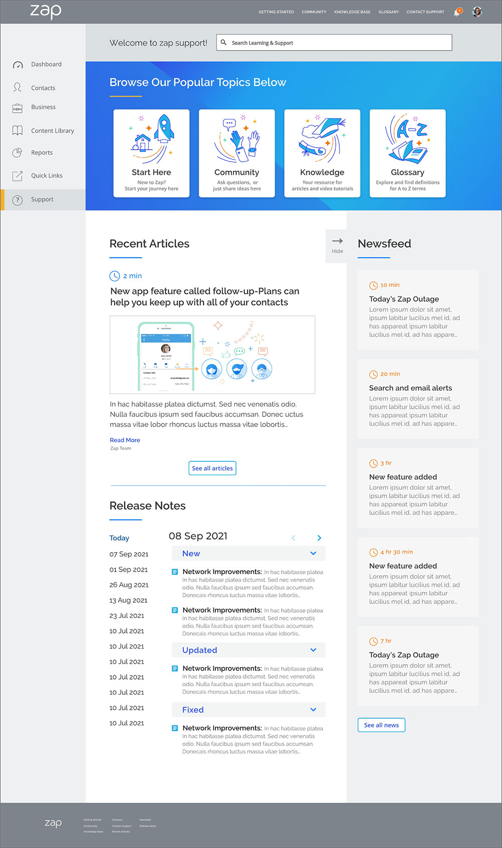
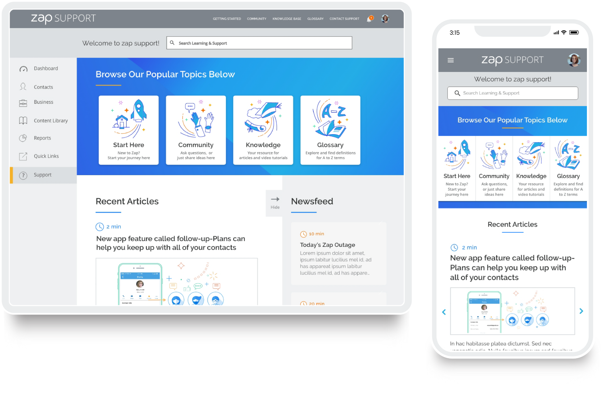
Final icons and page layout design for desktop and mobile
The illustrative buttons consisted of repeating elements for consistency which created a personalized experience using shared iconography.
Sections below kept the original content. I also provided artwork for the ‘Recent Article's' section. I designed the information to be more easily read and visually appealing.
Results
We created and shipped a fully functional support page where users were excited to engage, join the community, find answers to their questions, and share ideas.
Since the redesign of the Zap Support page, user testing has revealed that the embedded support pages are being visited with much greater frequency and customer complaints regarding the initial page are down by 88%.
We lowered the companies need for additional resources by reducing the number of enquiries from 70% to 20% to the support center.
Thank you for taking the time to view my case study.